Even though I completed by basic python classes before starting data science journey, I never thought of creating a visual representation for central limit theory (CLT) until recently. In this blog, I’ll be covering the following points
- Small explanation of CLT
- Smoothing of a curve
- CLT from Normal distribution.
- CLT from Exponential Distribution
- Python Code
Small explanation of CLT
The central limit theorem is a fundamental concept in statistics that describes the behavior of the sample mean of a random variable. Specifically, it states that if you take repeated random samples from a population, and calculate the mean of each sample, then the distribution of those sample means will be approximately normal, regardless of the underlying distribution of the population.
This means that even if the population is not normally distributed, as long as the sample size is large enough (typically at least 30), the distribution of sample means will still be roughly normal. Additionally, the central limit theorem states that the mean of the sample means will be equal to the population mean, and the standard deviation of the sample means will be equal to the population standard deviation divided by the square root of the sample size.
The central limit theorem is important because it allows us to make inferences about the population based on a sample. For example, if we want to estimate the average height of all people in a city, we can take a random sample of people and use the sample mean to estimate the population mean, knowing that the sample mean will be normally distributed.
Smoothing of a curve
Let’s see how sample size smoothens a curve. Even though this is an obvious point, having a visual image does not harm right?
Let’s take random numbers from a Normal distribution with Mean=0 and Standard deviation=1 and see how increasing the number of samples helps to smooth the curve. Below given is a histograms of such samples with number of sample=1000, 10,000 and 100,000

From here onwards, we will consider the last set of values (n=100,000)
CLT from Normal distribution
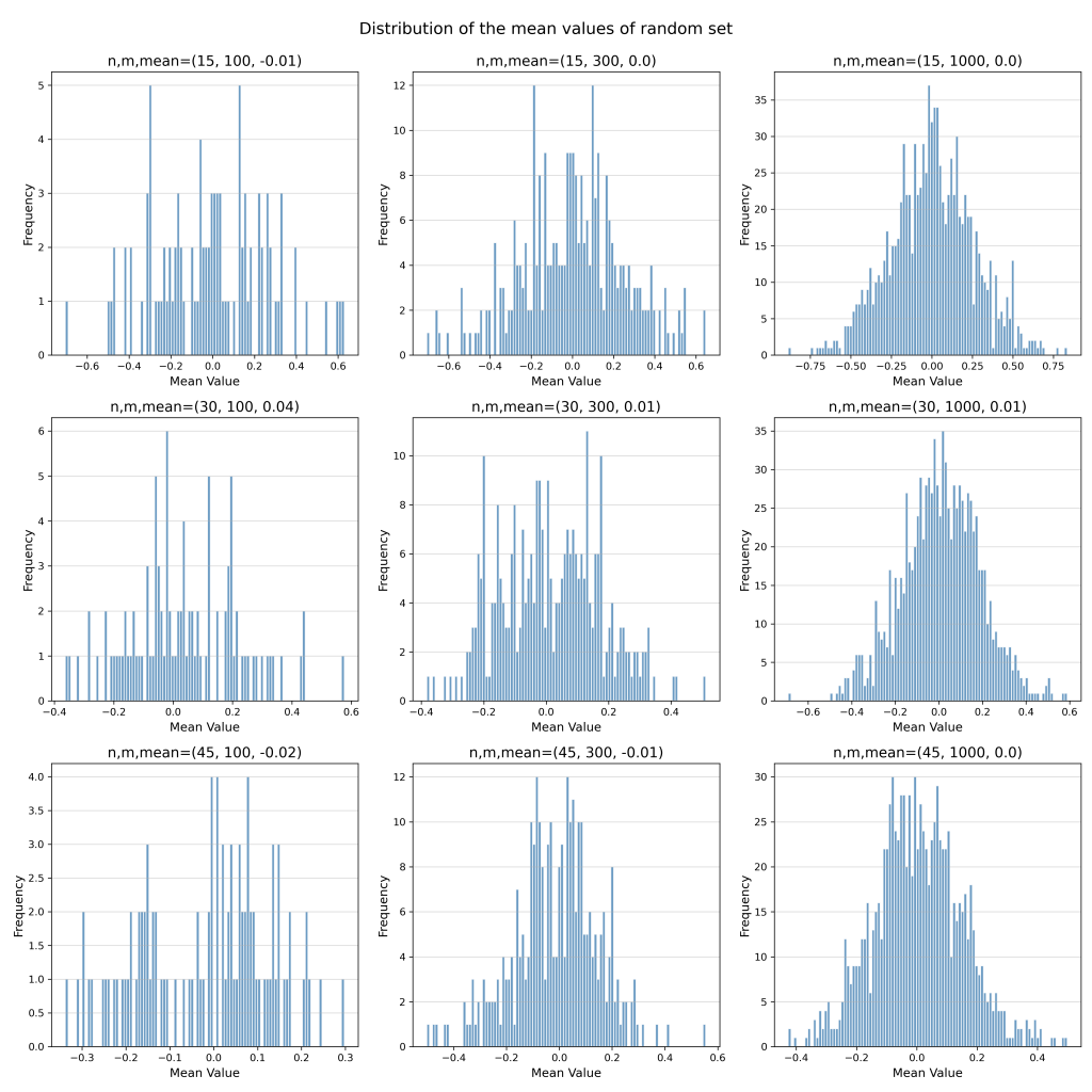
Now, we will take a random set of ’n’ number of samples from this distribution and repeat this process for ‘m’ times. Now that we have m sets of samples, we will take the mean of each of these sets and draw a histogram. We will also repeat this process all different combination of n and m values.
Now you can compare the figures and see how the number of sets and number of samples smoothens our curve. Note that for the mere calculation of distribution mean, even the smallest set gives very good approximation.

CLT from Exponential Distribution
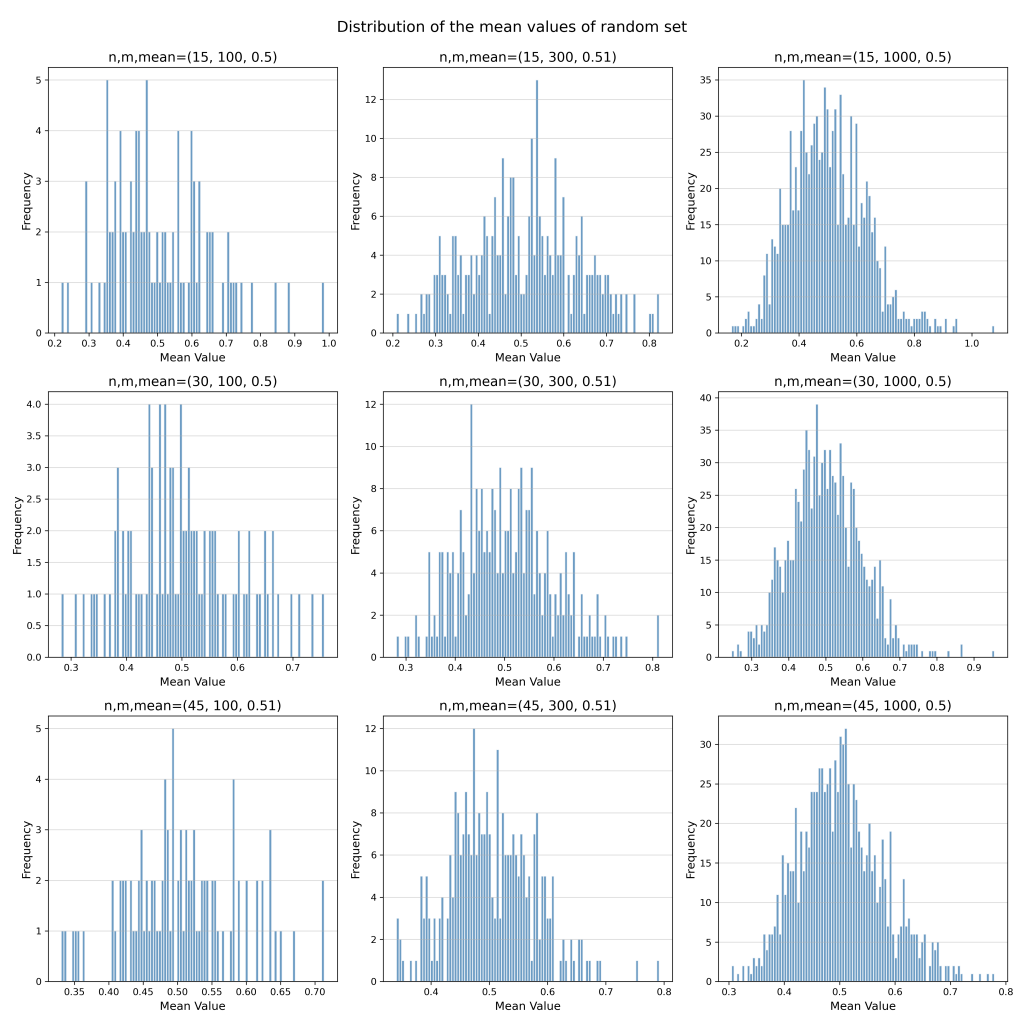
Now, we will repeat the same process with exponential distribution.
Scale of this distribution is λ=2 (or mean=1/ λ is 0.5)

Now if we apply CLT on this distribution, you will again get a normal distribution just like above.

Python Code
Please feel free to copy the below given python code and try out with different distributions.
def gaussian_distribution(n_values):
    fig, axs = plt.subplots(1, 3, figsize=(15, 5))
    for i, n in enumerate(n_values):
        mu, sigma = 0, 1  # mean and standard deviation
        s = np.random.normal(mu, sigma, n)
#         s = np.random.exponential(scale=0.5, size=n)
        axs[i].hist(s, bins=100, color='steelblue', edgecolor='white', alpha=0.8)
        axs[i].set_title(f'n={n}', fontsize=14)
        axs[i].set_xlabel('Value', fontsize=12)
        axs[i].set_ylabel('Frequency', fontsize=12)
        axs[i].tick_params(labelsize=10)
        axs[i].grid(axis='y', alpha=0.5)
    plt.suptitle('Sampling from Gaussian distribution', fontsize=16)

    plt.tight_layout()
    plt.savefig('Gaussian.png', dpi=300)
    plt.show()
    return (s)
def CLT(data,n_samples,n_sets):
    fig, axs = plt.subplots(len(n_samples), len(n_sets), figsize=(15, 15))
    for l,i in enumerate(n_samples):
        for m,j in enumerate(n_sets):
            # Select j sets of i samples each
            sets=np.array([np.random.choice(data, size=i) for _ in range(j)])
            # # Calculate means of each set
            means = np.mean(sets, axis=1)
            mean_=round(np.mean(means),2)
            ax = axs[l,m]  # Get the current subplot using indexing
            ax.hist(means, bins=100, color='steelblue', edgecolor='white', alpha=0.8)
            ax.set_title(f'n,m,mean={i,j,mean_}', fontsize=14)
            ax.set_xlabel('Mean Value', fontsize=12)
            ax.set_ylabel('Frequency', fontsize=12)
            ax.tick_params(labelsize=10)
            ax.grid(axis='y', alpha=0.5)

    plt.suptitle('Distribution of the mean values of random set\n', fontsize=16)
    plt.tight_layout()
    plt.savefig('CLT.png', dpi=300)
    plt.show()
import numpy as np
import matplotlib.pyplot as plt

n_values = [1000, 10000, 100000]
data=gaussian_distribution(n_values)
n_samples=[15,30,45]
n_sets=[100,300,1000]
CLT(data,n_samples,n_sets)